-
Notifications
You must be signed in to change notification settings - Fork 7
Autocomplete Docs Review #437
New issue
Have a question about this project? Sign up for a free GitHub account to open an issue and contact its maintainers and the community.
By clicking “Sign up for GitHub”, you agree to our terms of service and privacy statement. We’ll occasionally send you account related emails.
Already on GitHub? Sign in to your account
base: main
Are you sure you want to change the base?
Changes from 3 commits
File filter
Filter by extension
Conversations
Jump to
Diff view
Diff view
There are no files selected for viewing
| Original file line number | Diff line number | Diff line change |
|---|---|---|
| @@ -1,19 +1,32 @@ | ||
| # Autocomplete | ||
|
|
||
| Autocomplete is a component of Backendless UI-Builder designer. This allows you to select an item from a list of options. | ||
| Autocomplete is the component of Backendless UI-Builder designer. It allows selecting one of the options from the list. | ||
|
|
||
| <p align="center"> | ||
| <img src="./thumbnail.png" alt="main thumbnail" width="780"/> | ||
| <img src="./example-images/thumbnail.png" alt="main thumbnail" width="780"/> | ||
| </p> | ||
|
|
||
| All options are stored in a JSON object, that can be set either by using UI-Builder settings or Codeless Logic. You can also group options by passing a list containing JSON objects to the component: | ||
|
|
||
| <p align="center"> | ||
| <img src="./example-images/autocomplete_component_1.png" alt="Array of objects" width="780"/> | ||
| </p> | ||
|
Comment on lines
+9
to
+13
Contributor
There was a problem hiding this comment. Choose a reason for hiding this commentThe reason will be displayed to describe this comment to others. Learn more. Move it to example section. Also will be good to change image of JSON for real text JSON hidden under spoiler. |
||
|
|
||
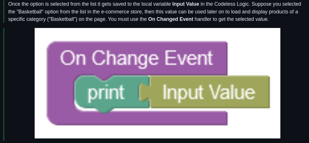
| Once the option is selected from the list it gets saved to the local variable **Input Value** in the Codeless Logic. Suppose you selected the "Basketball" option from the list in the e-commerce store, then this value can be used later on to load and display products of a specific category ("Basketball") on the page. You must use the **On Changed Event** handler to get the selected value. | ||
|
Contributor
There was a problem hiding this comment. Choose a reason for hiding this commentThe reason will be displayed to describe this comment to others. Learn more.
It's not completely correct. Better to say something like: we could access changed value from
Contributor
There was a problem hiding this comment. Choose a reason for hiding this commentThe reason will be displayed to describe this comment to others. Learn more.
Better to use options that we already use before(months from another example).
Contributor
There was a problem hiding this comment. Choose a reason for hiding this commentThe reason will be displayed to describe this comment to others. Learn more.
Typo - |
||
|
|
||
| <p align="center"> | ||
| <img src="./example-images/autocomplete_component_2.png" alt="On Changed Handler" width="780"/> | ||
| </p> | ||
|
Comment on lines
+17
to
+19
Contributor
There was a problem hiding this comment. Choose a reason for hiding this commentThe reason will be displayed to describe this comment to others. Learn more. |
||
|
|
||
|
|
||
| ## Properties | ||
|
|
||
| | Property | Type | Default Value | Logic | Data Binding | UI Setting | Description | | ||
| |---------------------------------------------|--------------------------------------------------------------------------|-----------------------------------------------------------------------------------------------------------------------------------------------------------------------------------------------------------------------------------------------------------------------------------------------------------------------------------------------------------------|---------------------------|--------------|------------|--------------------------------------------------------------------------------------------------------------------------------------------------------------------------------------------------------------------------------------------------------------------------------------------------------------------------| | ||
| | Disabled<br/>`disabled` | Checkbox | `false` | Disabled Logic | YES | YES | This handler allows you to disable a component. | | ||
| | Placeholder<br/>`placeholder` | Text | "Placeholder" | Placeholder Logic | YES | YES | This handler allows you to specify a label of autocomplete component. | | ||
| | Empty Options Label<br/>`emptyOptionsLabel` | Text | "No options" | Empty Options Label Logic | YES | YES | This handler allows you to add a label that will be displayed when the dropdown menu is empty. | | ||
| | Variant<br/>`variant` | Select [Outlined:`outlined`<br/>Standart:`standart`<br/>Filled:`filled`] | Outlined:`outlined` | Variant Logic | YES | YES | This handler allows you to specify the variant of autocomplete. | | ||
| | Disabled<br/>`disabled` | Checkbox | `false` | Disabled Logic | YES | YES | This handler allows disabling a component. | | ||
| | Placeholder<br/>`placeholder` | Text | "Placeholder" | Placeholder Logic | YES | YES | This handler allows specifying a label of autocomplete component. | | ||
| | Empty Options Label<br/>`emptyOptionsLabel` | Text | "No options" | Empty Options Label Logic | YES | YES | This handler allows adding a label that will be displayed when the dropdown menu is empty. | | ||
| | Variant<br/>`variant` | Select [Outlined:`outlined`<br/>Standart:`standart`<br/>Filled:`filled`] | Outlined:`outlined` | Variant Logic | YES | YES | This handler allows specifying the variant of the autocomplete. | | ||
| | Options<br/>`options` | JSON | `[`<br/>`{"groupLabel":"Winter",`<br/>`"children": [{"label": "December", "value": "December"},{"label": "January", "value": "January"},{"label": "February", "value": "February"}]},`<br/>`{"groupLabel": "Summer",`<br/>`"children": [{"label": "June", "value": "June"},{"label": "July", "value": "July"},{"label": "August", "value": "August"}]}`<br/>`]` | Options Logic | YES | YES | This handler allows you to add options to be displayed in the options list. Watch [Codeless Examples](#examples). Signature of options: list of objects `{value: String, label: String}`. Signature of grouped options: list of objects `{groupLabel: String, children: list of objects {value: String, label: String}}` | | ||
|
|
||
| ## Events | ||
|
|
||

Uh oh!
There was an error while loading. Please reload this page.